Note
Go to the end to download the full example code.
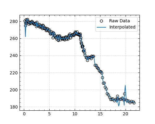
Plot the 1D ScatterData#
This example shows how to plot the 1D ScatterData object. I use a CO2 data file from the Antarctic EDC ice core (https://doi.pangaea.de/10.1594/PANGAEA.472488) as an example.
The following features are used:
Load the data (which just download from Pangaea without any modification)
Plot the raw data
Plot the interpolated data (based on cubic spline interpolation)
Plot the rolling averaged data
from cgeniepy.table import ScatterData
import matplotlib.pyplot as plt

# Load data
url = "https://doi.pangaea.de/10.1594/PANGAEA.472488"
edc_co2 = ScatterData(url)
edc_co2.set_index(['Gas age'])

fig = plt.figure(figsize=(5, 4))
ax = fig.add_subplot(111)

# Plot the raw data
edc_co2.plot(var='CO2', ax=ax,
        label='Raw Data', kind='scatter',
        edgecolor='black', facecolor='none', marker='o')

# # Plot the interpolated data (based on cubic spline interpolation)
interpolated_data = edc_co2.interpolate(var='CO2')
interpolated_data.plot(var='CO2', ax=ax, label='Interpolated', kind='line')

ax.legend()
plt.show()
Total running time of the script: (0 minutes 1.395 seconds)